The study focuses on the pedagogical applications of literary maps and the didactic orientation within the broader field of literary geography. The research question is, "What functionality should a digital map offer in educational settings to facilitate the exploration of place names from literary texts?" To answer the question, we developed an experimental tool to investigate place names mentioned in Norwegian literature 1814-1905, and arranged a session with literature students and a session with Norwegian teachers to explore user needs and the tool's pedagogical potentials in literary geographies. Our results show that both the literature students and the teachers considered the tool inspiring and triggering their curiosity. Our study confirms suitability of design choices, with the main map panel accompanied with frequency panel, and equipped with a moderate level of interactive functions that support building corpora, plotting extracted place names on an interactive map and listing them in a supplementary overview panel. Moreover, while the criticism received primarily concerned failed geolocations and slow system responses, suggestions for further development mainly focused on the search mechanism for place names in specific locations and on providing tutoring prior to the use of the map in upper secondary education.
Validating high-resolution weather and climate models is challenged by insufficient spatial and temporal resolution of meteorological observations, particularly for the precipitation in complex terrain. Traditional datasets, which rely on sparse official weather stations and gridded datasets, often lack the spatio-temporal resolution needed for accurate localized studies. This study serves as a first step in investigating the potential of including Personal Weather Stations (PWSs) in the validation of high-resolution regional climate models. We performed a quality control on PWS data, flagging approximately 13% and retaining around 450 stations in Western Norway. Compared to 124 official meteorological stations (MET stations), PWSs provided significantly improved spatial coverage, especially in densely populated areas, revealing spatial variability often missed by MET stations and traditional gridded datasets. We validated simulations from the Weather Research and Forecasting (WRF) regional climate model using the combined PWS and MET observational dataset for two cases: multiple frontal passages in November 2022 and a record-breaking convective burst in August 2023, which were sparsely captured by official MET stations. Although biases existed in the WRF dataset, the incorporation of PWSs in the observational dataset revealed a more nuanced precipitation pattern and provided enhanced spatial validation opportunities. In conclusion, PWS networks significantly enhance observational coverage, aiding high-resolution model validation and opportunities for improved local precipitation understanding. As the number of PWSs grows, refined quality control measures will further solidify their role in meteorological research and emergency preparedness, particularly for localized extreme weather events. This integration is vital for advancing climate science and improving community resilience to weather-related challenges.
This article presents a newly developed climate service designed to monitor climate risk in Norwegian municipalities using a variety of indicators. The service is accessible through a publicly available multimedia platform. With the expected increase in extreme weather events, many climate services have emerged focusing solely on future climate conditions, thus addressing only the hazard component of climate risk. As a result, most current local climate services evaluate how future climate will impact today’s society. The Intergovernmental Panel on Climate Change (IPCC), however, recently developed a risk framework consisting of four determinants: hazard, exposure, vulnerability, and response. Following this framework, our climate service incorporates all four risk determinants. It presents geographically and temporally varying indicators expressing current, near-future, and far-future projections or scenarios on hazard, exposure, and vulnerability, and maps these against current response levels. This approach enables us to identify which municipalities in Norway are most at risk and currently have the least adequate responses.
Landslide risk mitigation is limited by data scarcity; however, this could be improved using continuous landslide detection systems. To investigate which image types and machine learning models are most useful for landslide detection in a Norwegian setting, we compared the performance of five different machine learning models, for the Jølster case study (30 July 2019), in Western Norway. These included three globally pre-trained models; (i) the continuous change detection and classification (CCDC) algorithm, (ii) a combined k-means clustering and random forest classification model, and (iii) a convolutional neural network (CNN), and two locally trained models, including; (iv) classification and regression Trees and (v) a U-net CNN model. Images used included Sentinel-1, Sentinel-2, as well as digital elevation model (DEM) and slope. The globally trained models performed poorly in shadowed areas and were all outperformed by the locally trained models. A maximum Matthew’s correlation coefficient (MCC) score of 89% was achieved with a CNN U-net deep learning model, using combined Sentinel-1 and -2 images as input. This is one of the first attempts to apply deep learning to detect landslides with both Sentinel-1 and -2 images. Using Sentinel-1 images only, the locally-trained deep-learning model significantly outperformed the conventional machine learning model. These findings contribute to developing a national continuous monitoring system for landslides.
Emergency events such as floods and wildfires are handled by various responders and at various levels: strategic, tactical, and operational. To facilitate situational awareness, emergency responders require customized map-based decision support systems that are tailored to specific needs depending on the responders’ organizational affiliation, role, objectives, and occupationally specific knowledge. As a result, the systems are equipped with manifold map functions. However, the diversity of map-based emergency tools in use impedes gaining common user skills among their target audiences and thus, requires a systematic overview. Through a multistep research process, this study was to: investigate the requirements for support from map-based tools expressed by various emergency responders in Norway, identify desired map functions, and categorize those functions to facilitate an overview. Six stages constituted our workflow: meetings with Norwegian emergency responders, survey on selected map-based tools, interviews with designers and users of tools, a table-top exercise, theoretical considerations, and validation with stakeholders. This study contributes to the state of the art by systematizing and structuring knowledge about map functions that facilitate situational awareness. In turn, it helps developing and optimizing functionality of map-based tools depending on needs of specific emergency responders.
<p>Although Norway is a country with rough terrain and a high frequency instable steep slopes, there is a scarcity of landslide data available. This limits the accuracy of thresholds for early warning systems, and hazard maps, both of which rely on historic event data. There is great potential to supplement existing ground-based observations with automated landslide detection, using satellite imagery and deep learning. In working towards an automated system for landslide detection in Norway, we investigated which imagery types and machine-learning models performed best for detecting landslides in a formerly glaciated landscape.</p><p>We locally trained a deep learning model with the use of Keras, TensorFlow 2 and U-net architecture. As input data, we used multi temporal composites with Sentinel-1 and -2 image stacks of all available images from one month pre- and post-event. Processed bands included: dNDVI (difference in maximum normalised difference vegetation index) from Sentinel-2, and pre- and post-event Synthetic Aperture Radar (SAR) data (terrain-corrected, mean of multi-temporal ascending descending images, in VV polarisation) from Sentinel-1. Training and evaluation were performed with a well-verified landslide inventory of 120 manually mapped rainfall-triggered landslides from J&#248;lster (30-July-2019), in Western Norway. We tested the model with four input data settings using different bands and various polarization for the pre- and post-event SAR data, including: 1) full version (all 13 bands) 2) dNDVI (Sentinel-2), preVV, postVV (Sentinel-1), 3) preVV, postVV (Sentinel-1), and 4) post-R, post-G, post-B, post-NIR, dNDVI (Sentinel-2). The results were compared to the results of a pixel-based conventional machine learning model (Classification and Regression Tree) using the same input data. The second input data setting provides the best results. The performance scores show precision results for all four input data settings between 80-85%, with Matthews corelation coefficient values from 51-89%. Moreover, the deep-learning model significantly outperforms the conventional machine learning model in the input data setting #3. We see that the patch-based classification method far out-performs the pixel-classification due to the ability to differentiate the landslide signal from random noise produced from speckle in undisturbed areas. In addition, this represents one of the first attempts to fuse SAR and optical data for landslide detection, and we show there is an advantage in doing so in this case.</p><p>&#160;</p>
Scholars of natural resource governance argue that national and local governments must engage ordinary community members. When ordinary community members access information about the utilization of natural resource revenue and get an opportunity to provide feedback, the revenue management improves. In this article, the authors engaged Ghanaians through a spatial crowdsourcing platform for their opinion about petroleum management revenue in Ghana. The participants accessed the platform via their mobile phones and completed a survey on their opinions about petroleum revenue management, the Free Senior High School program, and their priority areas for petroleum revenue funding in Ghana. The results suggest that ordinary community members, and particularly women, seemed less informed about the management of petroleum revenue in Ghana. Furthermore, Ghanaians' opinions regarding their prioritized projects for petroleum revenue funding vary geographically. The authors conclude that decision-makers can use spatial crowdsourcing to engage ordinary community members in natural resource revenue management.
The delineating of bedrock from sediment is one of the most important phases in the fundamental process of regional bedrock identification and mapping, and it is usually manually performed using high-resolution optical remote-sensing images or Light Detection and Ranging (LiDAR) data. This task, although straightforward, is time consuming and requires extensive and specialized labor. We contribute to this line of research by proposing an automated approach that uses cloud computing, deep learning, fully convolutional neural networks, and a U-Net model applied in Google Collaboratory (Colab). Specifically, we tested this method on a site in southwestern Norway using both a set of explanatory variables generated from a 10 m resolution digital elevation model (DEM) and, for comparison, cloud-based Landsat 8 data. Results show an automatic delineation performance measured by an F1 score between 77% and 84% for DEM terrain derivatives against a manually-mapped ground truth. Overall, our automated bedrock identification model reveals very promising results within its constraints.
Large segments of populations in the industrialized West believe that immigrants cause crime. Some scholars suggest that it is generous welfare that attracts so-called "welfare magnets," increasing the possibility that the worst kind of immigrant locates in strong welfare states. Empirical studies on crime, however, do not support the view that immigrants are more to blame for crime than natives, although some immigrant groups might be overrepresented in crime statistics. We address this question by examining if immigration increases crime within Norwegian municipalities, thereby, indirectly testing whether Norway, one of the most generous welfare states, acts as a magnet for "bad" immigrants. Our results do not support the view that a strong welfare state with a lenient penal system generates moral hazard, nor that welfare states systematically attract the "bad" immigrants. These results support a host of studies from other industrialized countries, particularly the US, showing higher immigrant populations associated with lower crime. The results from Norway, thus, while showing some support for the view that welfare potentially cushions the many pathologies associated with crime and victimization, mitigating the development of criminogenic environments, are also in line with an emerging academic consensus. This consensus suggests that immigration reduces crime, which is good news for progressive policy and for generating a more nuanced discourse on the subject.
Geodashboards are often designed with explanatory elements guiding users. These elements (e.g. legends or annotations) need to be carefully designed to mitigate split attention or information integration issues. In this paper, we report expert interviews followed by a controlled experiment where we compare two interface designs with a focus on the split attention effect: (1) a multiple-legend layout with explanatory elements located next to each view, and (2) a single-legend layout with all explanatory elements gathered in one place. Different legend layouts did not affect the performance, but affected user satisfaction. 75% of the participants preferred the multiple-legend layout, and rated it with a higher usability score, mainly attributing this preference to the proximity of legend elements to the view of interest. Eye tracking data strongly and clearly verifies that participants indeed make use of the proximity: With the single-legend, the majority of eye-movement transitions were between the single-legend and the closest view to the legend, whereas with multiple-legend participants have shorter and more frequent legend visits, as well as more transitions between legends and views. Taken together, the design lesson we learned from this experiment can be summarized as ‘split the legend elements, but make it close to the explained elements’.
The study set out to investigate how the experience of creating a map-based participatory system might help identify what is needed to support the production of relevant volunteered geographic information (VGI) about urban areas exposed to impacts of adverse weather events in Trondheim, Norway. This article details the systematic approach used to collect VGI, starting from the active engagement of end users during the design and development process of the CitizenSensing participatory system, through using the system in two VGI campaigns, up to the examination of the collected data. Although the VGI examination identified exposed areas in Trondheim, for instance, those that are likely to accumulate surface water from heavy rains or meltwater, the experience gained from the use of the CitizenSensing system helped to identify some critical points regarding the production of relevant VGI. Potential practical implications justify the need for VGI. For instance, in the case of Trondheim, relevant VGI may result in better planned municipal interventions regarding city infrastructure for pedestrians, cyclists and drivers, increased public awareness and access to local knowledge about areas exposed to inundation. The study also confirmed the need for adequate system components for VGI vetting and exploration in the post-collection stage to obtain a comprehensive insight into collected VGI.
Field course is an important learning activity for students in disciplines like geography and biology. Unfortunately, lack of resources, large student groups, and unprepared students can result in students being passive rather than active during field course preparation. This article reports from a learning intervention where the use of StoryMaps replaced traditional lectures to increase active learning during field course preparation. StoryMaps is a multimedia platform with interactive functionalities, and we assess potential increased learning outcome from a learning intervention based on theories from geographic visualization. Students used StoryMaps to become familiar with the field course site and the field course assignments. As a follow-up, students had to write a reflection note about their thoughts and experiences from using StoryMaps. These notes revealed that students consider StoryMaps as helpful to access information from multiple sources in one visual platform, where they can choose how and what they want to learn, at what time, and in which order. Students also found that complex physical geographical-, and geomorphological principles became more concrete as StoryMaps helped them perceive these principles from multiple angles using pictures, videos, tasks, animations, and graphs. The few critical reflections are mainly related to minor technical issues.
For a geography bachelor course about climate change, we replaced the end-of-course exam with one term paper and three term-paper peer reviews. Our objectives were to design a learning environment where students read continuously throughout the semester, develop their writing skills, become familiar with quality criteria for academic texts, and get trained in applying these. To support students in their term-paper writing and term-paper peer reviews, we arranged two annotated-bibliography exercises as optional learning activities. A t-test demonstrated a statistically significant increase in performance for those who participated in these exercises compared to those who did not. A survey confirmed that students still doubt their own and their peer students’ capability to provide authoritative reviews, but qualitative interviews supported the findings that a majority of students found the peer-review process valuable for their reading behaviours and the development of their writing skills. The improvements, however, were mostly related to form (such as structure, grammar, and how to set up a proper reference list) and less related to academic content.
Cities are experiencing unprecedented climate impacts related to increasing temperatures, which vary within a city due to the heterogenous nature of urban environments. Adapting urban areas to heat requires efforts on multiple levels from urban governance, spatial planning and design to adapting everyday activities. This paper presents the prototype of a pedestrian routing tool to support citizens in navigating urban heat, and the results of tests and interviews with 24 practitioners and experts in Portugal and Sweden. The study aims to assess how and to what extent a navigation tool on urban heat could support urban climate risk management, and to evaluate the potential of the tool to support everyday adaptation and increase citizen engagement. We explore what functionality and additional information would be required to make the tool useful and relevant for different user groups. Results indicate that (i) climate services that fit in your pocket increase access to climate information and have potential to guide everyday adaptation practices; and (ii) applications need to be contextualized and tailored to match the needs and decision contexts of the user through integration of relevant information or tools.
Common operational understanding among engaged emergency responders is facilitated through shared operational pictures during crisis situations. Sharing is typically achieved through interactive tools, either desktop or web-based, in which map displays play an essential role. That role can be further strengthened if (1) agreed emergency symbols that are used in map-based interactive tools are sufficient to encode multifaceted operational information visually; and (2) the symbols are legible and meaningful for the diverse users of those tools. The authors revisited official emergency map symbols in use in Norway and reconsidered them against current requirements. To this end, they first conducted several meetings with stakeholders to elicit adequate revision requirements. Next, the reconsideration included the extension of the symbol set, symbol modification, and grouping. After the reconsideration, emergency management officers and specialists were interviewed. The interviews confirmed the agreement with the symbol categorization, extension of the symbols, and their modifications. The interviewees also made numerous suggestions to be considered in a follow-up study. Moreover, two concepts - symbol standardization and symbol harmonization - were proposed.
Central to this article is the issue of choosing sites for where a fieldwork could provide a better understanding of divergences in health care accessibility. Access to health care is critical to good health, but inhabitants may experience barriers to health care limiting their ability to obtain the care they need. Most inhabitants of low-income countries need to walk long distances along meandering paths to get to health care services. Individuals in Malawi responded to a survey with a battery of questions on perceived difficulties in accessing health care services. Using both vertical and horizontal impedance, we modelled walking time between household locations for the individuals in our sample and the health care centres they were using. The digital elevation model and Tobler's hiking function were used to represent vertical impedance, while OpenStreetMap integrated with land cover map were used to represent horizontal impedance. Combining measures of walking time and perceived accessibility in Malawi, we used spatial statistics and found spatial clusters with substantial discrepancies in health care accessibility, which represented fieldwork locations favourable for providing a better understanding of barriers to health access.
Rural areas cool off by night but built-up urban areas lack similar relief and may threaten vulnerable people’s health during heat waves. Temperature varies within a city due to the heterogenous nature of urban environments, but official measurement stations are unable to capture local variations, since they use few measurement stations typically set up outside of urban areas. Meteorological measurements may as such be at odds with citizen sensing, where absolute accuracy is sacrificed in pursuit of increased coverage. In this article, we use geographic information processing methodologies and generate 144 hourly apparent temperature surfaces for Rotterdam during a six-day heat wave that took place in July 2019 in The Netherlands. These surfaces are used to generate a humidex degree hours (HDH) composite map. The HDH metric integrates apparent temperature intensity with duration into one spatially explicit value and is used to identify geographical areas in Rotterdam where citizens may experience adverse health effects of prolonged heat exposure. Combining the HDH map with demographic data allows us to identify the most heat-exposed areas with the largest share of vulnerable population. These neighbourhoods may be the locations most in need of adaptation measures.
 Tomasz Opach合作论文数The Chair of Cartography, University of Warsaw32
 Päivi Lujala合作论文数Faculty of Science, University of Oulu12
 Tina Schmid Neset合作论文数Department of Thematic Studies, Linköping University11Carlo Navarra合作论文数8
 Halvard Buhaug合作论文数Peace Research Institute Oslo;Norwegian University of Science and Technology7
 Bjørn Erik Munkvold合作论文数Institutt for Informasjonssystemer, Fakultet for Samfunnsvitenskap, University of Agder6
 Gołębiowska Izabela合作论文数Dept Geoinformat Cartog & Remote Sensing, Univ Warsaw5
 Jaziar Radianti合作论文数College, Agder University5
 Lars-Erik Cederman合作论文数Department of Humanities, Social and Political Sciences, ETH Zurich;Center for Comparative and International Studies, ETH Zurich5
 Karin Dyrstad合作论文数SINTEF Technology and Society4
 Jimmy Johansson Westberg合作论文数Linköping University4
 Nils Petter Gleditsch合作论文数Peace Research Institute Oslo;Department of Sociology and Political Science, Faculty of Social and Educational Sciences, Norwegian University of Science and Technology4
 Bjorn-Ola Linner合作论文数Ctr Climate Sci & Policy Res, Linkoping Univ4
 Thomas Halvorsen合作论文数Department of Pediatrics, Haukeland University Hospital4Mikael Snaprud合作论文数4
 Erik Glaas合作论文数4
 Kristine Steen-Tveit合作论文数3
 Benjamin Cretois合作论文数Institutt for Naturforskning, Norsk3
 Sabrina Scherzer合作论文数3
 alexandra jarna合作论文数3
 Jolanta Korycka-Skorupa合作论文数Dept Geoinformat Cartog & Remote Sensing, Univ Warsaw3
 Anna Bohman合作论文数Dept Themat Studies Environm Change, Linkoping Univ3Haakon Lein合作论文数Department of Geography Trondheim, Norwegian University of Science and Technology3Tanja Ellingsen合作论文数3
 Geir Vatne合作论文数NTNU, Norwegian Univ Sci & Technol3
 Sara Santos Cruz合作论文数3
 John D. C. Linnell合作论文数Deprtment of Forestry and Wildlife Management, Inland Norway University of Applied Science;Department of Terrestrial Ecology, Norwegian Institute for Nature Research3Alister Munthali合作论文数University of Malawi3
 Arne H. Eide合作论文数3
 Michael Evan Goodsite合作论文数Division of Marine and Atmospheric Chemistry, University of Miami3
 Ola Fredin合作论文数Geol Survey Norway3
 Sofie Pilemalm合作论文数3J. Wilk合作论文数2
 Odd Inge Steen合作论文数2
 Martina Calovi合作论文数2T-S Neset合作论文数2Kristiane Midtaune合作论文数2svein andersland合作论文数2Lars Ole Grottenberg合作论文数2
 Erin Lindsay合作论文数Dept Civil & Environm Engn, Norwegian Univ Sci & Technol2
 Jakob Cyvin合作论文数2
 Steinar Nordal合作论文数Department of Civil and Environmental Engineering, Faculty of Engineering, Norwegian University of Science and Technology2
 Anne Gammelgaard Ballantyne合作论文数Department of Business Development and Technology, Aarhus University2
 Deborah Bunker合作论文数School of Health Sciences, Faculty of Medicine and Health, The University of Sydney2
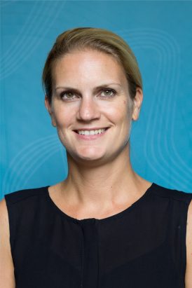 Ragnhild Nordås合作论文数Department of Political Science, College of Literature, Science, and the Arts, University of Michigan-Ann Arbor2
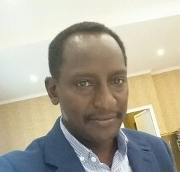 Ismail Hassan Ahmed Hassan Ahmed合作论文数2
 Stine Hellum Braathen合作论文数2
 Nils B. Weidmann合作论文数Department of Politics and Public Administration, University of Konstanz2
 Lotta E Andersson合作论文数Swedish Meteorological and Hydrological Institute2




