Here, we report on a longitudinal visual content analysis on mapping praxis in popular US news media outlets over the past decade. Maps are integral to data journalism, yet professional practice in storytelling with maps continues to outpace research and education. To fill this gap, we analyzed 119 online news stories containing maps published over two periods in 2014 and 2021 from the New York Times and Washington Post. We coded the sampled news maps according to three considerations: (1) conventional cartographic design (e.g., scale, projection, basemap, time, color depth, thematic map type, layout, map elements); (2) new digital technology (e.g., animation, interaction, real-time updates); and (3) visual storytelling techniques (e.g., story theme, genres, and tropes). The longitudinal visual content analysis provided a benchmark study for digital news mapping and yielded a number of insights into design trends, including: a decrease in the number and complexity of maps used in news stories; a shift away from mapping international stories towards domestic stories; a decrease in interactivity and an increase in animation due to a move towards mobile-first design and scrollytelling; an increase in mapping topics related to health, environment, and science; a decrease in the mapping of conflict, cultural affairs, and society; and, a decrease in the focusing attention trope, but an increase in metaphor and designer voice. Based on these findings, we argue for continued critical analysis of news maps within data journalism, and visual storytelling more broadly, because of their pervasiveness in new digital media and associated outsized influence on map audiences.
Here, we provide a retrospective and prospective analysis of the making and remaking of Mapping for a Sustainable World, an open-source Cartography textbook jointly published by the United Nations (UN) and International Cartographic Association (ICA). Our analysis follows a postrepresentational approach to Cartography, detailing a 'behind the scenes' look at the intentional book design process, revealing potentially transferable insights for designing maps about the UN Sustainable Development Goals (SDGs) and atlas-like compendiums broadly. Retrospective design insights include recommendations for making the book like an atlas using a grid-based template and the golden ratio, best practices for working with the highly uncertain and dynamic SDG global indicator database, and lessons learned for designing SDG maps by maintaining a living map specification sheet. Retrospective processual insights include the formation of a core Editorial Team, detailed justification of the evolving book and chapter scoping, and the multi-stage review process coordinating international activities during the COVID-19 pandemic. Ongoing prospective activities include development of a translation guide for multilingual use of the book, expansion of the book section dividers into an annual atlas-like campaign, composition of open source QGIS technical tutorials to recreate figures from the book, and articulation of a research agenda on SDG mapping. Dans cet article nous pr & eacute;sentons une analyse r & eacute;trospective et prospective de la cr & eacute;ation et de la refonte de l'ouvrage Mapping for the Sustainable World/Cartographier pour un monde durable, un manuel de cartographie en libre d'acc & egrave;s co-publi & eacute; par les nations unis (NU) et l'association de cartographie internationale (ACI). Notre analyse suit une approche post-repr & eacute;sentationelle de la cartographie, en d & eacute;taillant les coulisses du processus de conception intentionnelle de l'ouvrage et en mettant en valeur des id & eacute;es potentiellement utiles pour concevoir des cartes sur les objectifs de d & eacute;veloppement durable (ODD) des nations unis ou d'autres ouvrages de type atlas en g & eacute;n & eacute;ral. Les enseignements r & eacute;trospectifs sur la conception incluent des recommandations pour un ouvrage de type atlas en utilisant un caneva bas & eacute; sur une grille et le nombre d'or, les bonnes pratiques pour travailler avec la base de donn & eacute;es des indicateurs mondiaux des ODD, base de donn & eacute;es tr & egrave;s incertaine et dynamique, ainsi que des le & ccedil;ons tir & eacute;es pour la conception de cartes sur les ODD en maintenant des sp & eacute;cifications cartographiques & eacute;volutives. Les enseignements r & eacute;trospectifs du processus incluent la formation d'une & eacute;quipe & eacute;ditoriale principale, la justification d & eacute;taill & eacute;e de l'& eacute;volution des objectifs de l'ouvrage et de ses chapitres et le processus de r & eacute;vision en plusieurs & eacute;tapes coordonnant les activit & eacute;s internationales pendant la pand & eacute;mie. Les activit & eacute;s prospectives en cours comprennent l'& eacute;laboration d'un guide de traduction pour un usage multilingue de l'ouvrage, l'extension des s & eacute;parateurs de section du livre pour une campagne annuelle de type atlas, la cr & eacute;ation de tutoriels techniques open source pour refaire les figures & agrave; partir du livre et l'articulation d'un agenda de recherche sur la cartographie des ODD.
In this article, we report on a content analysis of peer-reviewed cartographic research contributions over ten years (2015-2024) in the four International Cartographic Association (ICA) affiliated journals. We adapted a taxonomy of scholarly contributions to cartography to identify patterns across five types of research contributions: conceptual, empirical, methodological, technical, and applied. Our content analysis findings illustrate that the discipline of cartography is healthy regarding research productivity but dominated by scholars in the Global North. All four of the ICA-affiliated journals publish all five research contributions, but each journal has a unique identity related to the types of contributions they most commonly promote. Across the articles, empirical research was most common, while methodological contributions were rarest. Conceptual research garnered the highest citations, and applied contributions the lowest. Surprisingly, critical cartographic scholarship was less common than expected and historiographies were more common than expected. Methodological contributions are important for the reproducibility of methods, and we viewed technical contributions as essential to the practitioner-oriented discipline. Finally, applied research is an important way to contribute interdisciplinary and/or community-engaged research. We discuss potential reasons for the patterns we observed and provide suggestions for researchers in cartography to make their research contributions salient.
Online atlases can be powerful storytelling mediums with unique narrative structures, conveying narrative on two levels: within individual maps and across atlas webpages. Here, we treat online atlases as interactive digital narratives (IDN), or stories that respond to user feedback, to understand how online atlases can work as linear and nonlinear visual stories. Specifically, we adapted and expanded a map-based situated learning tool called Global Madison (https://www.geography.wisc.edu/globalmadison) into an online atlas with two distinct narrative structures: one leveraging linear, longform (i.e. 'scrollytelling') and the other utilizing nonlinear, network structures. We then hosted four focus groups with different user and stakeholder groups of Global Madison to assess the relative advantages and limitations of each narrative structure. Our results suggest that, overall, participants preferred the linear narrative structure of the longform version over the nonlinear network version. However, feedback demonstrated that online atlases can benefit from mixing characteristics of both linear and nonlinear storytelling. Additional design recommendations for online atlases derived from the focus groups include: limit whitespace in longform infographics, use consistent lengths across webpages in the atlas, provide multiple navigational methods, and clarify hyperlink destinations through strong affordances. The final Global Madison Atlas is available at: https://uwcartlab.github.io/GlobalMadison/atlas/#/. Les atlas en ligne peuvent & ecirc;tre de puissants supports de narration avec des structures narratives uniques, qui transmettent des r & eacute;cits & agrave; deux niveaux : au sein de chaque carte et & agrave; travers les diff & eacute;rentes pages de l'atlas. Ici, nous consid & eacute;rons les atlas en ligne comme des r & eacute;cits num & eacute;riques interactifs ou des histoires qui r & eacute;pondent aux commentaires des utilisateurs, pour comprendre comment les atlas en ligne peuvent fonctionner comme des histoires visuelles lin & eacute;aires et non lin & eacute;aires. En particulier, nous avons adapt & eacute; et d & eacute;velopp & eacute; un outil d'apprentissage bas & eacute; sur des cartes, appel & eacute; le Global Madison (https://www.geography.wisc.edu/globalmadison), en un atlas en ligne avec deux structures narratives diff & eacute;rentes : une structure de forme lin & eacute;aire et longue (i.e. l'histoire racont & eacute;e) et l'autre utilisant une structure non lin & eacute;aire en r & eacute;seau. Nous avons ensuite organis & eacute; quatre groupes de discussion avec diff & eacute;rents utilisateurs et parties prenantes du Global Madison afin de v & eacute;rifier les avantages et limitations de chaque structure narrative. Nos r & eacute;sultats sugg & egrave;rent que, avant tout, les utilisateurs pr & eacute;f & egrave;rent la structure narrative lin & eacute;aire de forme longue & agrave; la version non lin & eacute;aire en r & eacute;seau. Pourtant les commentaires ont montr & eacute; que l'atlas en ligne pourrait tirer parti d'un mixte entre les caract & eacute;ristiques des structures lin & eacute;aires et non lin & eacute;aires. Les autres recommandations de conception d'atlas en ligne d & eacute;duites des groupes de discussion sont les suivantes : limiter les espaces blancs dans les infographiques de forme longue, utiliser des longueurs coh & eacute;rentes sur toutes les pages web de l'atlas, proposer plusieurs m & eacute;thodes de navigation et rendre les destinations des hyperliens compr & eacute;hensibles gr & acirc;ce & agrave; des indices visuels intuitifs. L'atlas Global Madison final est disponible & agrave; l'adresse https://uwcartlab.github.io/GlobalMadison/atlas/#/.
In this paper, we present an eye tracking experiment to evaluate how blue light filtering of digital maps reduces visual fatigue and thus promotes vision care in public health. Prolonged exposure to light from digital screen reading results in visual fatigue, and visible light in the blue range exacerbates visual fatigue because it requires the highest energy output to display onscreen. System-level blue light filtering increasingly is used as a "nighttime" mode for short screen sessions at night and is purported to combat visual fatigue for longer screen sessions throughout the day. Blue light filtering is particularly relevant to cartography, as blue is among the most common colors used on maps for both denotative and aesthetic purposes. To this end, we conducted a one-factor eye tracking experiment with 78 participants to evaluate the effects of three blue light filtering conditions. The experiment used the recently released "teal-based" style of Google Maps as the visual input for blue light filtering, a digital web map that is publicly available and has a broad user base. We collected eye tracking measures correlated with visual fatigue related to map reading such as blinking frequency and pupil diameter, with a mixture of Likert-based self-reported measures. We demonstrate empirically that low levels of blue light filtering can alleviate visual fatigue without compromising the denotive and aesthetic quality of digital maps, although high levels of blue light filtering impedes performance and aesthetics. Our results indicate that low blue light filtering delays visual fatigue by 3-4 min and high blue light filtering by 6-7 min. Our findings also provide preliminary evidence that reading digital maps for a short period of time does not lead to visual fatigue; however, visual fatigue may appear after reading digital maps for 18 min, offering new evidence for the design of digital maps that consider eye care and visual health.
Here, we consider how the process of mapping influences affect, creativity, and pedagogy through a sketch mapping workshop with youth teenagers from the Bridge-Lake Point-Waunona Neighborhood Center in Madison, Wisconsin (USA). Specifically, we asked how the mapmaking process promotes (1) a pleasant and activated affective experience for non-verbal emotional expression; (2) a creative, therapeutic-like activity for intra- and interpersonal discovery and healing; and (3) a critical pedagogical intervention for learning about how mapping can be a meaningful and empowering process. We learned several processual insights from the workshop. First, engaging with the process of sketch mapping supported a positive affective experience and enabled non-verbal emotional expression, demonstrating the importance of interpreting each participant's sketch mapping process individually. Second, participants expressed excitement for high-quality art materials and preferred multiple forms of visual expression, leading to unexpected collaborative sketching, interpersonal exchange, and processing of real traumas. Third, the use of sketch mapping centred the process of mapmaking, reducing self-consciousness of incomplete designs and promoting an inclusive mapmaking experience. Finally, our experience led to several recommendations for using sketch mapping as critical pedagogy, including limiting free sketching, injecting elements of play and competition, delineating sketching media, making the experience less school-like, and phrasing critical thinking prompts on process over product.
The role of cartography in environmentally-sustainable development is twofold: first, useful and usable maps enable sense making and decision making about environmental processes, impacts, and protections; second, maps themselves, as digital tools, can be more energy efficient in minimizing our impact on the environment. In this paper, we elevate this energy awareness as a key design consideration for maps and introduce a novel conceptual framework for considering the carbon footprint of the content, form, and use of maps. We first systematically investigate how specific map design decisions impact the energy consumption of digital devices. We then discuss the possible ways that digital maps can be greener, outlining a series of ‘big questions’ about the content, form, and use context of maps needing future research to realize greener maps. Finally, we assert that green cartography requires not only novel techniques to design green maps but also greater attention to shaping individual, organizational, and social attitudes towards environmentally-friendly maps.
Here, we introduce Next Generation Cartographers, a Working Group of the International Cartographic Association (ICA) Students and early-career professionals today learn cartographic design alongside a diverse array of conceptual and technical competencies and, therefore, are working at the forefront of the discipline. However, they typically are not among the leading voices within the cartography community simply due to experience. To this end, we organized a Next Generation Cartographers (NGC) workshop at EuroCarto 2022 to identify opportunities and challenges for the next generation of cartographers. During our discussions, advocacy, peer support, mentorship, and outreach emerged as key needs of next generation cartographers and, ultimately, the need for NGC to have a voice in ICA planning. Inclusion became a core value of NGC to promote safety and diversity across the cartography community. NGC opened to global membership in August 2023 at the International Cartographic Conference in Cape Town, South Africa, and became a Working Group in autumn 2023.
In this article, we present a collective research agenda for mobile-first and responsive cartographic design. The research agenda explicitly focuses on challenges regarding design, and we begin by establishing a partial design space for mobile-first and responsive maps and visualizations, situating these design considerations within the constraints, enablements, and consequences of mobile technology. Specifically, we present 20 research challenges facing mobile-first and responsive cartography and visualization, with research challenges organized by five dimensions (i.e., sets of design decisions) of the design space: (1) scale and generalization, (2) projections, (3) symbolization and visual hierarchy, (4) toponymy and typography, and (5) user interaction. The agenda crosses and organizes a range of research foci in cartography and visualization - such as augmented/mixed reality, indoor/outdoor mapping, egocentrism, focus+context techniques, energy-aware design, glanceable visualization, visual storytelling, UI/UX design, multi-modal and embodied interaction, and inclusive design - centering conceptual, practical, and critical questions for design throughout.
The article introduces a three-part research agenda for mobile-first maps and visualizations developed by the International Cartographic Association (ICA). Interactive mapping applications drawing on location based services and mobile technologies are ubiquitous in everyday life, fundamentally transforming how we consume maps and therefore experience places as we move through them. Accordingly, we need to update the established cartographic canon for mobile platforms as well as develop new techniques to ensure a productive and satisfying user experience with mobile maps and visualizations. Here, we describe a two-day workshop to develop a set of three research agendas on opportunities and challenges facing mobile cartography. Specifically, we discuss two major breakthroughs from the workshop: (1) a consensus definition of a 'mobile' or 'mobile-first' map or visualization to refer to a design that is both optimized for small screens and location-aware and (2) organization of the three-part research agenda based on the definition of a mobile user interaction as the dialogue between a human (user issues) and a map (design issues) mediated through a mobile device (technological issues). We summarize the three research agenda articles to introduce this special issue and conclude with a discussion on cross-cutting themes emerging since developing the special issue.
The past decade has witnessed the rapid development of geospatial artificial intelligence (GeoAI) primarily due to the ground-breaking achievements in deep learning and machine learning. A growing number of scholars from cartography have demonstrated successfully that GeoAI can accelerate previously complex cartographic design tasks and even enable cartographic creativity in new ways. Despite the promise of GeoAI, researchers and practitioners have growing concerns about the ethical issues of GeoAI for cartography. In this paper, we conducted a systematic content analysis and narrative synthesis of research studies integrating GeoAI and cartography to summarize current research and development trends regarding the usage of GeoAI for cartographic design. Based on this review and synthesis, we first identify dimensions of GeoAI methods for cartography such as data sources, data formats, map evaluations, and six contemporary GeoAI models, each of which serves a variety of cartographic tasks. These models include decision trees, knowledge graph and semantic web technologies, deep convolutional neural networks, generative adversarial networks, graph neural networks, and reinforcement learning. Further, we summarize seven cartographic design applications where GeoAI have been effectively employed: generalization, symbolization, typography, map reading, map interpretation, map analysis, and map production. We also raise five potential ethical challenges that need to be addressed in the integration of GeoAI for cartography: commodification, responsibility, privacy, bias, and (together) transparency, explainability, and provenance. We conclude by identifying four potential research directions for future cartographic research with GeoAI: GeoAI-enabled active cartographic symbolism, human-in-the-loop GeoAI for cartography, GeoAI-based mapping-as-a-service, and generative GeoAI for cartography.
In this paper, we discuss our experiences advancing a professional-oriented graduate program in Cartography & GIScience at the University of Wisconsin-Madison to account for fundamental shifts in conceptual framings, rapidly evolving mapping technologies, and diverse student needs. We focus our attention on considerations for the cartography curriculum given its relevance to (geo)visualization education and map literacy. We reflect on challenges associated with, and lessons learned from, developing a comprehensive and cohesive cartography curriculum across in-person and online learning modalities for a wide range of professional student audiences.
 Alan MacEachren合作论文数Department of Geography, College of Earth and Mineral Sciences, Pennsylvania State University18
 Anthony C. Robinson合作论文数GeoVISTA Center;Department of Geography;Pennsylvania State University;GeoVISTA Center, Pennsylvania State University12
 Carl Sack合作论文数10
 Kristen Vincent合作论文数7
 Ricker Britta合作论文数Department of Geography, University of Washington/Utrecht University7
 Amy L. Griffin合作论文数Sch Sci, RMIT Univ6Heather Rosenfeld合作论文数5
 Nick Underwood合作论文数5Sarah A. Moore合作论文数5richard g donohue合作论文数Dept Geog, Univ Wisconsin5
 Eric Nost合作论文数Univ Guelph5Meghan Kelly合作论文数5Justine Blanford合作论文数Penn State Univ, University Pk5
 Michael Stryker合作论文数Department of Physiology, University of California, San Francisco5
 Shane Loeffler合作论文数R280 Learning & Environm Sci4
 Timothy Prestby合作论文数4Chelsea Nestel合作论文数4
 Carolyn S Fish合作论文数University of Oregon4
 Andre Mendonca合作论文数School of Technology, Amazonas State University4
 Yuhao Kang合作论文数Univ Wisconsin, Dept Geog, Geospatial Data Sci Lab, Madison, WI 53706 USA4
 Mingguang Wu (吴明光)合作论文数School of Geography, Nanjing Normal University4
 Luciene Stamato Delazari合作论文数Universidade Federal do Paraná4TR Wallace合作论文数3
 Song Gao (高松)合作论文数Department of Geography, University of Wisconsin-Madison3Lily Houtman合作论文数3
 Nick Lally合作论文数Univ Kentucky3
 jari korpi合作论文数Department of Built Environment, Aalto University3
 Jack Williams合作论文数Department of Geography, University of Wisconsin3
 Cynthia Ann Brewer合作论文数Department of Geography, College of Earth and Mineral Sciences, Pennsylvania State University3Kevin Ross合作论文数3
 Menno Jan Kraak合作论文数Department of Geo-information Processing, Faculty of Geo-Information Science and Earth Observation, University of Twente3
 David Hart合作论文数3
 Kristien Ooms合作论文数3
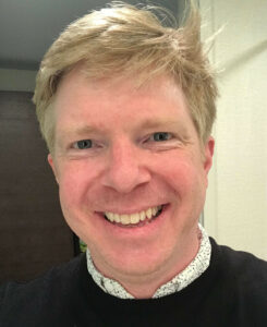 Simon Goring合作论文数Department of Geography, University of Wisconsin – Madison3
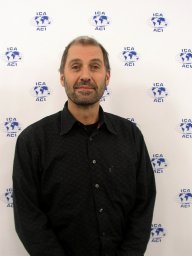 Corné P. J. M. Van Elzakker合作论文数International Institute for Geo-Information Science and Earth Observation3
 Homero Fonseca Filho合作论文数3
 Arzu Coltekin合作论文数Dept Geog, Univ Zurich3
 Mark Harrower合作论文数3
 Scott Pezanowski合作论文数Brightworld Labs;Gulf Bank;Rochester Institute of Technology3Eugene J Lengerich合作论文数3Donald F. Charles合作论文数2Russell W. Graham合作论文数2
 A-xing Zhu合作论文数School of Geography, Nanjing Normal University2Tanya Buckingham合作论文数2
 Julia Janicki合作论文数2CM Sack合作论文数2Megan Roessler合作论文数2Rashauna Mead合作论文数2Joel Przybylowski合作论文数2