This study designed and evaluated a user-centered augmented reality (AR) wayfinding prototype for Leeds University Union (LUU), aiming to improve student wayfinding efficiency and encourage social exploration within a particular campus environment. A site-specific field study involving photographic documentation of existing wayfinding aids, such as signage and maps, was conducted to investigate the current design. Five semi-structured interviews were carried out to gain students’ experiences and opinions, complemented by behavioral observations of three participants navigating the LUU with existing wayfinding aids to explore common challenges and dilemmas. Results showed that the existing design did not consistently support effective navigation, with participants relying on assistance from others. Furthermore, all of the students reported using the LUU mainly for social and recreational purposes, indicating that integrating navigation with real-time event information could enhance campus community engagement. In response, a prototype mobile navigation application named LUU MATE was developed that integrated AR with social exploration features to enhance both wayfinding and engagement in campus life. The iterative optimization of the prototype was based on usability tests conducted by four participants. Subsequently, a second behavioral observation was conducted with three participants using LUU MATE to assess its navigation effectiveness and potential to foster social engagement. Comparative analysis with earlier observations showed that LUU MATE reduced the time required to complete the navigation tasks and stimulate participants’ interest in campus life. This study indicates that both navigation efficiency and social engagement are essential considerations in campus wayfinding design. Future research should involve larger and more diverse participant groups and apply the design across varied campus sites to validate its broader applicability.
Printed or digital text is a primary communication medium. Reading is necessary for locating, understanding, and using information in our personal and professional lives. The importance of reading makes typography essential to accessibility. The purpose of this systematic literature review was to examine design factors that influence the legibility and readability of accessible typography, resulting in 42 peer-reviewed empirical studies (2000–2025) that report on typeface design, typesetting, and other factors affecting legibility and readability of typography in Latin alphabet-based languages. Key findings include: (1) serifs are not a significant legibility factor; (2) no single type size or typeface optimizes readability for everyone in every situation; and (3) familiarity may be a significant legibility and readability factor. These results suggest that accessible typography guidelines should reflect the complexity and nuance involved in optimizing readability and identify several research gaps. Future research should explore typeface design characteristics beyond serifs within type classifications, the influence of familiarity on readability and reading skills, the potential transferability of familiarity between similar typefaces, the duration of the familiarization process, the persistence of its effects, and whether reader motivation and adaptability can outweigh these effects. Additionally, accessible typography research may benefit from studies incorporating natural reading conditions, materials that better reflect current design practices, more diverse reading measures, and in-depth qualitative approaches.
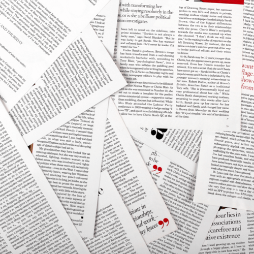
As the printed book co-exists with the influence of the digital, narratives become hybrid and are transformed into documents in which the content can very easily flow from one form to another. As a result of this, the first decades of the 21st century have seen the emergence of publications that challenge traditionally orthodox reading practices. This article examines the response to the digital development in novels that foreground the material dimension of the narrative and are print-specific. These works do not reject the digital realm but absorb its characteristics and expand the possibilities offered by the material dimension of the book. By analyzing Graham Rawle’s Woman’s World and its process of creation through the collage and cut-up techniques, this article aims to show how design can contribute to foreground the physical dimension of literature in novels with hypertangible qualities. This examination draws attention to design being embedded in the writing process that constructs both material and narrative dimensions. Findings show that these novels can be a product of a ‘designwriting’ process, in which design serves both as a tool to shape a narrative, and as a process that expands it and creates an object that offers an embodied reading experience. Ultimately, this highlights the importance of physical reading in the age of digital media.
This study investigates how postmodern graphic design strategies can be critically reimagined — reframed through the lens of bilingual design pedagogy to engage issues of cultural identity, script interaction, and typographic experimentation — within Arabic–English bilingual contexts. Using the Visible Language journal (late 1960s–2025) as a foundational reference, the research was conducted over three academic semesters with 90 undergraduate design students in Kuwait. Through a structured practice-led research methodology, participants analyzed historical cover designs and developed original bilingual compositions inspired by postmodern aesthetics. The project addressed typographic challenges, including directionality, visual hierarchy, and the interplay between Arabic calligraphic and Latin modular forms. Design strategies — including layering, fragmentation, and grid disruption — were systematically explored to facilitate visual integration across scripts. Outcomes ranged from cohesive bilingual compositions to instances of double monolingualism reflecting varied levels of synthesis. Cultural motifs and script-specific conventions emerged as influential factors shaping design decisions. The study concludes that adapting postmodern design principles to bilingual contexts requires more than stylistic translation; it entails critical negotiation of cultural identity, linguistic equity, and the visual dynamics of multilingual communication.
Political communication in the United States today is often characterized by ‘information disorder’. However, studies of information disorder do not take into account the role of design in contributing to this phenomenon. Through a visual analysis of American political communication, specifically 19th-century sensational newspapers and 21st-century post-factual websites, this paper addresses gaps in current studies by analyzing two design elements: layout and display typography. In doing so, this study demonstrates how it is possible to use visual analysis to uncover the various presentations of the visual rhetoric that characterizes information disorder. This paper begins by situating sensational design within literature on design theory and visual rhetoric, sensationalism, and political aesthetics. The paper then examines layout and display typography in case studies of American political news from both 19th-century sensational newspapers and 21st-century post-factual news websites, two periods of ‘information disorder’ in American media, to understand how the visual rhetoric of ‘sensational design’ manifests differently in the two eras of ‘information disorder’. The paper concludes with a discussion of how layout and typography ‘act’ as elements of visual rhetoric, how design can be incorporated into current conceptions of political aesthetics, and the implications of such a relationship.
This essay examines the visual language of textile tickets — small, printed labels used on cotton bales and fabric lengths — produced by British printers for export to colonial India between the mid-19th and early 20th centuries. Emerging amidst expanding colonial trade and advances in printing technology, these ephemera evolved into vivid, ideologically charged artifacts. Focusing on a collection of textile tickets produced by Manchester-based printing firm B. Taylor and Co., this study explores three recurring visual themes: empire, religion, and gender. It argues that these images did more than advertise textiles: they glorified British imperial authority, appropriated Indian religious imagery, and idealized women as passive ornamental objects to enhance appeal in a male-dominated trade. Through visual and contextual analysis, this essay demonstrates that textile tickets — often valued only for aesthetics — also functioned as everyday instruments of colonial control.
This (ashamedly) autobiographical account of my research career describes my journey from psychology to what might be described as psychotypography. A key aspect of the narrative is the means by which I sought to integrate into a design environment. I explore the notion of interdisciplinary research, an important feature of this journal, reflecting much of the current landscape of design education, research, and practice. The juggling of similarities and differences occurs at the level of disciplines and as part of my research methods. A common thread through most of the research is evaluating how people respond to visual material, to create findings that can be used in design practice and education. Broader implications are that many factors, within and outside our control, determine the course of research.
What are we? As Maria dos Santos Lonsdale (2025) revealed in the April issue’s introductory editorial, this issue takes as its consideration the present, following that issue’s consideration of the past. The articles reveal various perspectives on our present. Well, “our” depends upon who is doing the reflecting. Ramanathan (2025), Zhang et al. (2025), and Medley and Haddad (2025), all in rather different ways, discuss cultural or personal identities that must be addressed in the things we design and the ways we go about designing them. An outsider might think that these external factors are what our field would struggle with — as we do — but that we would have internal clarity about our field’s identity. Speaking for myself — as an editor of a journal in the field, and as a senior faculty member who instructs graduate students on the nature of the field and its scholarship — I have no such clarity.
The editorial goals of three editors for Visible Language are discussed sequentially, showing the development of the journal over 58 years of continuous publication. Particular attention is paid to research in communication design, a goal of the current editor. Several suggestions regarding the interdisciplinary nature of the journal and its future are discussed.
This article is grounded in an exploration conducted by the author on publishing as a platform that brings intercultural communication, pluralism, graphic design and typography into productive dialogue with each other through engaged (in social and political issues; in creative, educational, and critical practice) and situated (local communities; international networks of editors, translators, designers, illustrators, publishers, and readers) design research frameworks and practices. This has resulted in an exploration of spaces in which new kinds of documents can be created, with, by and for marginalized publics, and, conversely, how the production of new texts and images creates spaces that enable emancipatory, temporary, or subversive practices to occur that suggest new directions for the practice of typography and typographic frameworks. This exploration through design research and practice, is framed by the author’s own context, as that of a South Asian designer and researcher, working in the Global North. Some of the initial thinking in this article was explored in a chapter for The Routledge Companion to Design Research — 2nd Edition. The article takes a holistic, post-disciplinary approach to graphic design and typography aiming to challenge notions of graphic design as purely aesthetic or craft-based, or as concerns of form and function. It calls for a shift in considering the wider politics and contributions of visual language — graphic design and typography specifically — to societal change. Additionally, it reframes research-led practices (and thereby visual language and typography), not as an elite activity but as a human practice that emerges as curiosity and intent. Such an approach is critical to undertake considering a global health crisis, climate emergency and with issues of conflict and social injustice where communication plays a pivotal role. The article concludes that how we approach design research and practice needs to be rethought so that it makes a meaningful contribution to planetary issues.
We last published a special issue (52.3) devoted to student research in 2018. That issue focused on participant research and encompassed studies of a range of artifacts within typography, illustration and communication design (including: handwriting and branding, posters, maps, eInk displays, resources for people with aphasia, garment label design, storytelling with new digital tools, live art and social media spaces). They shared an engagement with everyday contexts for human-centered design.
Design research now has an established history extending over more than 60 years. The current robust state of the field indicates that there has been real development and consolidation, including the establishment of academic journals. Most significantly, design is now recognized as an academic discipline. Disciplines need good journals in order to flourish — research has to be made visible.
This opinion piece reflects on the disciplinary status of design, focusing on visual communication, or graphic design, within academia. It responds to optimistic assessments of design’s progress by highlighting persistent challenges and opportunities for strengthening its disciplinary identity.
This paper discusses the role of text alignment on the speed and accuracy of navigational responses for participants who read English but not Chinese when presented with bilingual Chinese/English traffic signs. Two text alignment conditions (centered and ragged right settings) are tested in relation to two independent variables: sign complexity and vertical separating spacing between scripts in a pair of studies. Video materials are used to provide a safe way to simulate how and where road signs may appear in a driving scenario, while efficiently testing many variations. The results suggest that left alignment improves speed and accuracy in complex, multi-direction signs with narrower vertical separating spacing, whereas central alignment may be beneficial for simpler signs with single direction indications. These findings highlight the value of including alignment specification in guidance for bilingual signage, especially when accounting for sign complexity. However, it would be important to conduct further studies using methods with a higher ecological validity and a broader range of participants before robust recommendations can be devised.
In looking for a competitive edge, a growing number of organisations are adopting design thinking strategies, with a focus on visual methods. The future may be more about visual design as a thinking tool, and less as an end in itself. Graphic designers, illustrators, and those that educate them, must start to concern themselves with how pictures can be put to use with deliberate intent. Our pedagogical approach is to encourage students to break an image down into pictures of different levels of fidelity. To develop these competences some principles are borrowed from J.J Gibson, who separated the definitions of image and picture . This allows students to think about the tasks towards which they put images, and to consider what kind of picture—specific or more universal—is most appropriate to fix the image down. Lessons provoke students to imagine a world without text, where deliberate visual communication can only be had with the appropriate choice of pictures. These methods, intended to improve the visual literacy capabilities of students, are developed against the challenging backdrop presented by a contemporary culture which assumes that effective depiction is accurate depiction and that pictures are necessarily more vague than words.
Generative AI is rapidly being adopted in diverse research contexts that, given the specificity of theoretical frameworks and research objectives, require a high degree of semiotic precision in AI output. With text-to-image generative models, the selection of subject matter and subsequent stylistic variation both have the potential to influence measurable desired outcomes. A major challenge in using generative models in design research is achieving a form of fidelity between a visual representation and a corresponding concept that must be conveyed. Scott McCloud’s Big Triangle categorizes a broad range of visual representational stylistic variation, largely based on comic art. We extend McCloud’s work with a more systematically described framework called the Pictorial Trapezoid, which offers greater control in producing new pictures with generative AI. We provide a case study of the process by which we developed the Pictorial Trapezoid, and demonstrate its efficacy for an additional two research use cases. In each case we differentiate project-specific criteria for selecting what is being represented and visualizing that selection. Finally, we describe how an AI might be trained for semiotic precision in distinct research contexts using the Pictorial Trapezoid.
This paper is a methodological exploration of human-AI collaboration in academic writing and publishing. Using critical autoethnography, the author engages in a process of becoming with the technologies and, because of this, shows us ways of embodying change. The narrative weaves together the mutually influential relationship between personal experience, the happenings of culture, and emerging AI technology. It is a tracing of practice, a way of thinking with and through—asking questions about and acting on—these experiences and happenings. In the context of communication futures, theory is not a static body of knowledge or an autonomous set of ideas, objects, or practices. Instead, theorizing is an ongoing, fluid process that links the concrete and the abstract, thinking and acting, aesthetics and criticism. (Holman Jones 2016, 229) Credited solely to the author, this piece provides a case study of academic writing developed with the unwavering assistance of Artificial Intelligence (AI). What remains hidden from the reader is the back-and-forth interaction between the author and the AI assistant—these interactions typically involve the author asking the machine to comment on fluency, so that the author can then make micro-adjustments to things such as spelling, grammar, and sentence structure. On occasion, it involves learning about paraphrasing by observing how the AI paraphrases. In the final manuscript, this level of interaction is not visible because it would disrupt the reader's flow and comprehension, as well as obscure the author's intent. There are instances, however, where the dialogue is less entangled, which allows the author to italicize their prompts to the machine and the machine's responses to be highlighted. In addition to AI technologies, uncertainty is engaged with as ‘generative technology’ for imagination, experience, and action. (Akama, Pink, and Sumartojo 2018, 46) By embracing both uncertainty and AI in practice, the author seeks to better understand how emerging technologies might serve to support, limit, and enhance the author’s ability to write about their practice. This article hypothesizes that communication futures will involve collaboration between humans and human-AI technologies and that the significance of critical thinking and creativity will remain pertinent. It also proposes that to produce thoughtful, contextually appropriate, and non-biased outcomes, we must embrace collaborative mindsets and adopt respectful, participatory, inclusive, and diverse processes that build capability.
The study investigates the integration of visual cultural elements in emerging scripts and the motivations driving their development. With 293 scripts existing for approximately 7000 spoken languages, many Indigenous communities are creating their own scripts to preserve language and culture amidst declining linguistic diversity. By examining ten scripts, including Wancho, Chisoi, Mwangwego, and others, the research identifies four main types of visual cultural elements: common cultural icons and images, influences from traditional art forms, elements from indigenous knowledge systems, and traditional body art forms. The analysis reveals that integrating these elements enhances script acceptance within communities, fostering a stronger connection with users. Furthermore, the study explores five primary motivations for script development: resistance towards dominant groups, unification of marginalised groups, expression of cultural identity, language preservation, and recuperation of literacy. Findings suggest that while visual cultural elements significantly impact script acceptance, the motivations behind script development also provide valuable insights into historical and contemporary trends in global script innovation. The study highlights the importance of incorporating visual cultural elements in script design to ensure cultural continuity and language preservation.
This paper aims to examine engagement for a specific Instagram practice of fashion curators: the use of text-as-image. It builds upon previous research, which indicates that fashion curators frequently post images of text (Sand et al. (2022)). The study examines the multimodal digital communication by fashion curators from a design perspective, with a focus on engagement. Its mixed-methods approach combines qualitative eye-tracking, surveys, semi-structured interviews, participative netnography, thematic content analysis, and data analytics. It draws on communication and museum studies to gain a better understanding of how the visual elements of language are used and received in the Instagram environment. Findings indicate that while engagement with text-as-image is higher with certain typographies and sizes, engagement is also dependent on certain caption characteristics. Furthermore, they indicate that a cross-pollination of digital fashion communication and museum studies research, particularly museum label guidelines and visitor engagement studies, may benefit both domains.
The World Health Organisation develops and delivers a range of technical documents outlining best practice procedures with the aim of improving global health outcomes and with emphasis on supporting low- and middle-income countries. However, these guidelines and other normative standard setting products tend to have low uptake and implementation in the countries and communities they aim to reach due a range of system level barriers and decision-making processes. These barriers are compounded by a disconnect between the individuals who write and develop guidelines, typically in wealthy nations, and those who are expected to implement them at the country level, typically in middle- and low-income countries. In order to address this problem, we employ the Digital Tactile Tools co-design method as a means to understand the lived experience of implementing guidelines in country contexts. By drawing on participatory design, we show that alternative approaches to generating and testing, at scale, communication design processes is a viable and important means to developing more inclusive and responsive global health guidance. With this example we suggest that communication futures must consider the wider context and environmental factors in which information will be used and understood.





