In this paper, we introduce persistent scatterer interferometry (PSI) as a new and promising application domain for Visual Analytics (VA). PSI studies changes of the Earth's topography by analyzing large time-varying point clouds that easily comprise hundreds of millions of data points. We briefly outline the PSI analysis workflow and present a VA approach to the first step in this workflow based on a flexible and interactive filtering mechanism. We further describe challenges for VA in PSI analysis. We want to engage the VA community in a discussion about potential VA solutions because we expect these solutions to not only advance PSI analysis but also provide valuable insights and contributions for the VA community regarding exploration and analysis of spatiotemporal data.
To better detect and study processes on the Earth's surface, scientists want to combine various satellite data and extract potentially interesting patterns from the combined data. This analysis approach is called multi-sensor analysis. In this paper, we present an interactive visual exploration solution for the first important step of multi-sensor analysis: the assessment and selection of remote sensing scenes. This solution is the first step towards a larger Visual Analytics (VA) approach that turns multisensor analysis into a transparent and interactive analysis method. We conduct our research in the context of GeoMultiSens, which is an interdisciplinary research project between remote sensing, computer science and VA experts. To demonstrate the utility of our visual exploration solution, we use a real-world scenario: the assessment and selection of scenes in order to study the change of forest cover in Europe. The application example indicates that interactive visual exploration facilitates a structured assessment of the quantity and quality of remote sensing scenes and enables scientists to exclude low-quality scenes from subsequent multi-sensor analysis.
Multi-sensor analysis is a novel scientific approach in remote sensing science. The basic idea is to enable users to combine various satellite mission data (called scenes) into a common data set. This combination produces millions of high-resolution time series (one time series for each pixel) from which users want to extract potentially interesting spatio-temporal patterns. A challenge of multi-sensor analysis is that users often experience difficulties interpreting the extracted patterns. We use Visual Analytics (VA) to help users understand these patterns. We learned from our interdisciplinary cooperation in the GeoMultiSens project that VA has to support the assessment and selection of scenes suitable for the current application scenario and question to achieve this goal. The contribution of this paper is twofold. First, we describe how we devised a VA approach that supports users in the assessment and selection of remote sensing data based on a user and task analysis. We demonstrate how our VA approach helps users to select and assess scenes to study forest cover change in Europe between 2010 and 2016. The study of forest cover change is an important scientific scenario because the loss of forest cover has negative effects on the environment, such as undermining the capacity of ecosystems to maintain fresh water, loosing the ability to regulate the climate, and poorer air quality. Second, we discuss the Scientific Data Explorer, our research vision for VA to enable users to effectively develop VA approaches for a variety of scientific scenarios.
Researchers assess the quality of an ocean model by comparing its output to that of a previous model version or to observations. One objective of the comparison is to detect and to analyze differences and similarities between both data sets regarding geophysical processes, such as particular ocean currents. This task involves the analysis of thousands or hundreds of thousands of geographically referenced temporal profiles in the data. To cope with the amount of data, modelers combine aggregation of temporal profiles to single statistical values with visual comparison. Although this strategy is based on experience and a well-grounded body of expert knowledge, our discussions with domain experts have shown that it has two limitations: (1) using a single statistical measure results in a rather limited scope of the comparison and in significant loss of information, and (2) the decisions modelers have to make in the process may lead to important aspects being overlooked. In this article, we propose a Visual Analytics approach that broadens the scope of the analysis, reduces subjectivity, and facilitates comparison of the two data sets. It comprises three steps: First, it allows modelers to consider many aspects of the temporal behavior of geophysical processes by conducting multiple clusterings of the temporal profiles in each data set. Modelers can choose different features describing the temporal behavior of relevant processes, clustering algorithms, and parameterizations. Second, our approach consolidates the clusterings of one data set into a single clustering via a clustering ensembles approach. The consolidated clustering presents an overview of the geospatial distribution of temporal behavior in a data set. Third, a visual interface allows modelers to compare the two consolidated clusterings. It enables them to detect clusters of temporal profiles that represent geophysical processes and to analyze differences and similarities between two data sets. This work is the result of a close collaboration with ocean modelers. They employed our concept to find aspects of improvement in a new version of the Ocean Model for Circulation and Tides (OMCT).
Numerous measurement devices and computer simulations produce geospatial time series that describe a wide variety of processes of System Earth. A major challenge in the analysis of such data is the complexity of the described processes, which requires a simultaneous assessment of the data's spatial and temporal variability. To address this task, geoscientists often use automated analyses to compute a compact description of the data, ideally comprising characteristic spatial states of the process under study and their occurrence over time. The results of such automated methods depend on the parameterization, especially the number of extracted spatial states. A particular number of spatial states, however, may only reflect certain spatial or temporal aspects. We introduce a visual analytics approach that overcomes this limitation by allowing users to extract and explore various sets of spatial states to detect characteristic spatiotemporal patterns. To this end, we use the results of hierarchical clustering as a starting point. It groups all time steps of a geospatial time series into a hierarchy of clusters. Users can interactively explore this hierarchy to derive various sets of spatial states. To facilitate detailed inspection of these sets, we employ the concept of interactive visual summaries. A visual summary is the depiction of a set of spatial states and their associated time steps or intervals. It includes interactive means that allow users to assess how well the depicted patterns characterize the original data. Our visual interface comprises a system of visualization components to facilitate both the extraction of sets of spatial states from the hierarchical clustering output and their detailed inspection using interactive visual summaries. This study results from a close collaboration with geoscientists. In an exemplary analysis of observational ocean data, we show how our approach can help geoscientists gain a better understanding of geospatial time series.
Environmental models produce geospatial time series containing many spatio-temporal patterns. Scientists need to understand these patterns to analyze the behavior of the simulated environmental systems. We combine clustering and visualization to generate an intuitive visual summary of geospatial time series that captures the data’s prominent spatio-temporal information. As a first step, we evaluated our approach with well-understood observational data. Our visualization depicted all prominent features of these data suggesting that our method is readily applicable to environmental model output
Simulation models are essential means of scientific knowledge building and also the basis for decision-making. Because of their relevance, they have to be assessed thoroughly with respect to their quality. Simulation model assessment comprises two challenges: (a) modelers have to create a comprehensive mental image of the model's quality despite the massive multidimensional, multivariate, and often heterogeneous data; and (b) the model assessment process should be as efficient as possible. We face these challenges with a visual analytics approach. We aim at developing interactive visual representations which, in combination with present computational analysis methods, support the scientist's reasoning process to enhance the assessment of simulation models. In a design study, we analyzed two exemplary reasoning processes which cover the main model assessment procedures: the evaluation of the internal coherence of the model's structure and behavior and the assessment of its empirical validity. The analysis was conducted by means of a user- and task-centered approach which combines several knowledge elicitation techniques and task analysis concepts. We derived domain tasks as well as cognitive actions and developed and implemented interactive visualization components which supplement the statistical analysis methods already used. An informal qualitative user study shows that our visual analytics approach and tools help gain a more detailed mental image and hence a better understanding of the data and the underlying simulation model and allow for a faster and more comprehensive assessment of the simulation model.
 Doris Dransch合作论文数8Daniel Eggert合作论文数6
 Mike Sips合作论文数Stanford University
Gates Computer Science
Graphics Lab6Jan Fajerski合作论文数2
Mike Sips合作论文数Stanford University
Gates Computer Science
Graphics Lab6Jan Fajerski合作论文数2 Daniel Scheffler合作论文数Geog Dept, Humboldt Univ2Behling Robert合作论文数2
 Julian Kuhlmann合作论文数2
 Alexander Reinefeld合作论文数2Mathias Peters合作论文数2
 André Hollstein合作论文数2
 Dirk Pflugmacher合作论文数Department of Forest Science, Oregon State University2
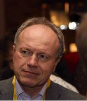 Johann-Christoph Freytag合作论文数Institut für Informatik, Mathematisch-Naturwissenschaftliche Fakultät, Humboldt-Universität zu Berlin2
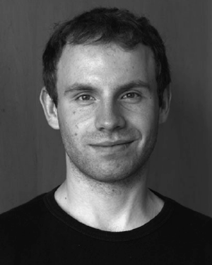 Andreas Rabe合作论文数2Andrea Unger合作论文数2Henryk Dobslaw合作论文数2
 Patrick Hostert合作论文数Earth Observation Lab, Geography Department, Faculty of Mathematics and Natural Sciences, Humboldt Universität zu Berlin2Florian Schintke合作论文数Zuse Institute Berlin;Computer Science Research2
 Patrick Griffiths合作论文数Humboldt-Universität zu Berlin;Geomatics Lab - Department of Geography;Geomatics Lab, Humboldt-Universität zu Berlin2
 Carl Witt合作论文数Humboldt-Universität zu Berlin61
 Andreas Schenk合作论文数1
 Norbert Marwan合作论文数Potsdam Institute for Climate Impact Research;Institute of Geosciences, University of Potsdam;Institute of Physics and Astronomy, University of Potsdam1Volker Klemann合作论文数1
 Sven Schulte合作论文数1




